Design Analysis
“Life is short. Future doesn’t come with any guarantees. You want something in life, you gotta go for it.”
Netflix has been a godsend for everyone stuck at home during the ongoing pandemic. I was no exception as I proceeded to binge-watch the diverse library ranging from Avatar: The Last Airbender to Selling Sunset. As a so-called Marvel Mania and lover of all things fantasy, The Umbrella Academy caught my eye early. As one of my most enjoyed shows, I chose The Umbrella Academy's poster to do my design analysis.
The Grid System
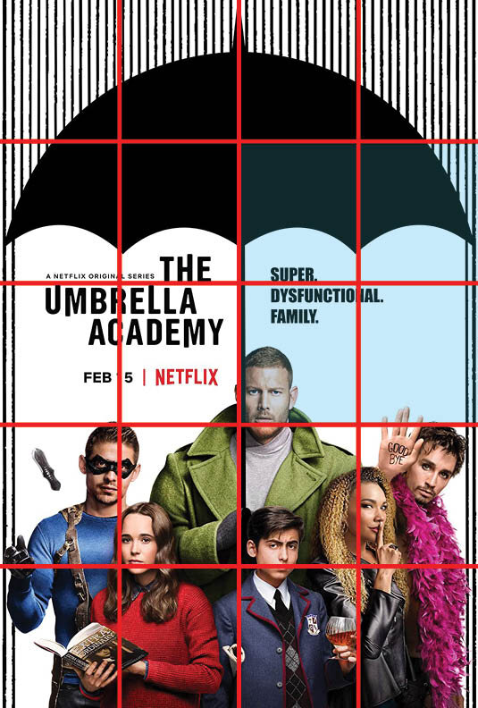
The poster has a well designed underlying grid system through the giant umbrella, and the vertical lines portraying rain—the umbrella and the rain frame the main subjects; the text and the people.
Even so, I divided the poster with a 4x3 grid. All of the black graphics are above the 2nd horizontal line, as shown in image 1.
The text is in between horizontal lines 1 and 3. The thick line representing the handle of the umbrella or vertical line 2 splits the text into two parts. As seen in image 2, the show's title is framed nicely with the grid's intersection aiming around the middle of the text. The tagline is framed on the other side, as seen in image 3.
Lastly, all of the people are framed below horizontal line 3 as seen in image 4. It is important to note that everyone’s faces align with an intersection or is on the grid line.
Overall, the grid system is used effectively to organize the main elements of the poster and align all important elements on an intersection.
Hierarchy of Elements
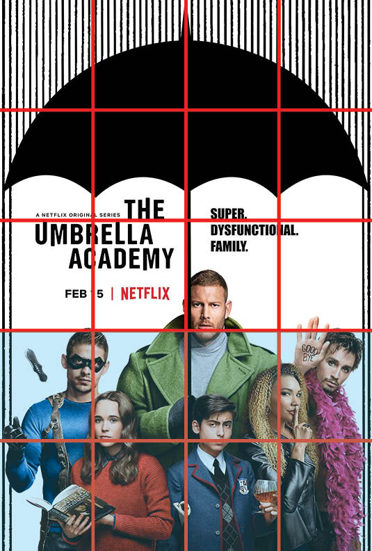
I labeled section 1 of the image as the first element in the hierarchy as the contrast of black text with a lot of white space caught my eye immediately.
Afterward, my eye goes to section 2. This section's image differs significantly from the rest of the poster due to its use of vibrant colors and varying scales.
The top portion of the poster is labeled in section 3. While the umbrella's black graphic is enormous in scale, the rain's repeating lines create a pattern and merges into the background. Also, from section 2, the umbrella's handle is used as a leading line to prompt the audience's eye to follow the line up to the third hierarchy of elements.
Altogether, design elements were effectively used to have a correct hierarchy of elements. The title is the most essential information, then the characters, and, subsequently, additional graphics.
Negative Space
The large amounts of negative space used in the middle of the poster are effective in many ways.
As the poster is very hectic on the top and bottom, due to the rain-like pattern and colorful people, respectively, the middle ground becomes the breathing space. This allows the poster to give focus to the title and tagline.
The whitespace is also effective in a logical grouping of elements. The space frames the typography as well as separate the people and the graphics.
Typefaces
Using the myfonts.com website, I was able to identify three typefaces used in the poster. The title is using a custom font called the Hargreeves Rounded. The tagline is using Impact MT. The smaller texts are using the Blooming Elegant Sans family.
While each font does not come from the same family, they are using a sans typeface and all letters are capitalized.
Color System
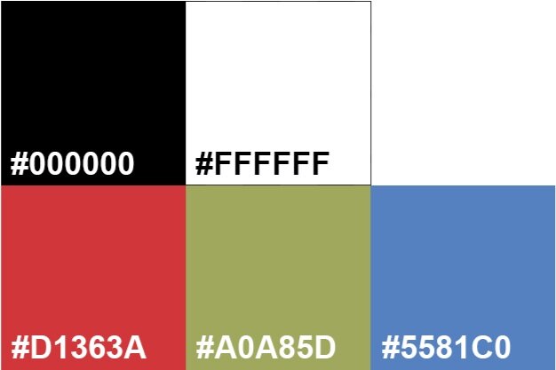
The poster is mainly using black and white for the title and the graphics.
The use of primary colors, red, green, and blue, allows for a colorful contrast.


